Hockey sweaters. The badge of honor. The first thing you notice when you turn on a game — and sometimes, the last thing you want to look at.
Over the years, NHL jerseys have gone from classic, stitched-on beauties to “WTF were they thinking?” marketing experiments. So let’s break down the best, the worst, and the what-in-God’s-name of NHL jersey history.
🏆 The Best of the Best
🔵 St. Louis Blues – 1967-84 (Original Classic)
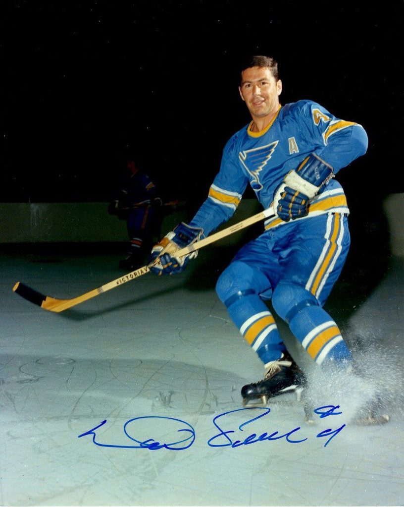
Clean. Timeless. Understated. That golden trumpet of hockey tradition. There’s a reason people still rock these at the bar.
🔴 New Jersey Devils – 1992-2010 (Red and Black Era)

Before they got bored and tried to rebrand oatmeal, these were menacing and mean — like Marty Brodeur’s five-hole.
🍁 Toronto Maple Leafs – 1967 Centennial Throwback
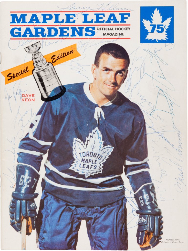
An all-time classic. Sharp, patriotic, and somehow makes you forget they haven’t won a Cup since before the moon landing.
🟣 LA Kings – 1998-2011 (Purple and Black)
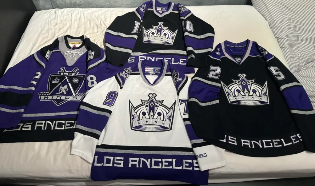
Criminally underrated. Regal and intimidating. Looked like someone who’d knock your teeth out and sign your kid’s jersey after.
🔴⚫ Chicago Blackhawks: Iconic, Controversial, Undeniably Clean
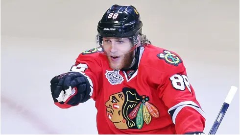
Say what you want about the name or logo — and there are valid conversations to be had there — but if we’re talking strictly jersey aesthetics, the Blackhawks’ sweaters are chef’s kiss.
The red home jersey with the bold black-and-white striping? Timeless. The shoulder patches, the laces, the crispness of the colors — it just looks like hockey. Whether it’s Toews lifting the Cup or a fan wearing it to a beer league game, it always pops.
There’s a reason it constantly ranks at the top of best jersey lists. It’s tough, traditional, and screams Original Six.
🔵🔴 New York Rangers: Broadway Blues, Forever Sharp
The Rangers jersey is pure class. No gimmicks, no redesigns for the sake of change — just that diagonal “RANGERS” and a font that’s older than most teams in the league.
It’s clean, it’s tough, and it’s steeped in history. When you see it flying down the wing at MSG under the lights, it just feels right. The Lady Liberty alternates have their place in history, sure, but the classic blues? That’s legacy.
It’s a jersey that doesn’t need a rebrand — because it is the brand.

🗑️ The Worst
🧻 New York Islanders – 1995 “Fisherman” Jersey
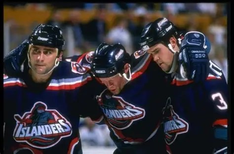
The Gorton’s Fisherman. The jersey equivalent of slipping on the ice in front of your crush. It’s legendary — but not in a good way.
🚮 Dallas Stars – 2003 “Mooterus” Jersey

Designed by someone who failed 7th grade biology. Was it a bull? A uterus? We may never know.
📉 Buffalo Sabres – 2006 “Slug” Jersey
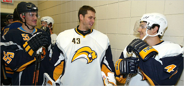
When they abandoned the royal blue and gold for this PowerPoint clip-art slug, Western New York collectively dry-heaved.
😵 The WTF Moments
🧃 Anaheim Ducks – 1996 Wild Wing Jersey

A cartoon duck crashing through the ice. Yes, this happened. And yes, someone got paid for this idea.
🌈 Vancouver Canucks – 1978 “Flying V”

If someone asked you to wear a full-body chevron to the rink, would you? Vancouver did. Bright yellow, brown, and red. Blinding.
🖤 Los Angeles Kings – Chrome Stadium Series Helmets (2021)
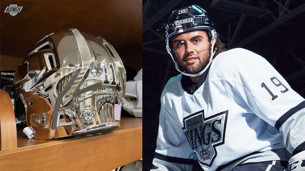
We know this is about jerseys, but those chrome domes deserve a mention. Looked like RoboCop joined beer league.
🧵 Honorable Mentions
- Hartford Whalers (forever iconic)
- Tampa Bay’s 1997 “Stormy Water” alternate (pure chaos)
- Vegas Golden Knights’ gold jerseys — looks like a casino floor, somehow works.
Final Whistle
Jerseys aren’t just fabric — they’re history, heartbreak, glory, and a few very questionable design meetings.
Got a favorite jersey? Or one you want to throw in the penalty box forever? Drop it in the comments or tag us on socials. Just don’t say the Bruins’ Pooh Bear jersey was bad — we’ll block you.
