I feel like I went to Vegas and lost all my money. These new alternate jerseys are gold but at what cost? After watching this video I was anticipating something really great but once again the Golden Knights let me down.
Vegas had a chance to highlight the secondary logo but just changes one color and there’s your third jersey. The sparkly gold is gaudy and really makes a statement which isn’t a bad thing for Vegas I just feel like there could have been more. The Vegas Strong logo would have been nice touch. How sleek could the Golden Knights look in all black with the secondary logo on the chest?

During the 2018-2019 season the NHL announced several teams would get alternate jerseys. Vegas was left off this list and many VGK fans were upset. Well, here we are now with these awful “gold” puke mustard looking jerseys and I’m not sure who to blame. Adidas or whoever made the call in the Golden Knights organization…Bill Foley?
About a month after the NHL made the alternate jersey announcement sinbin.vegas published a story on a concept designed by Drew Goldfarb.
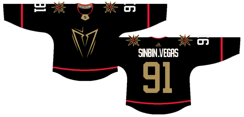
I’m not exactly crazy about the above design but its way better than the gold threads. Read more about this concept design here. I really hope these look better on the ice because the overall consensus seems to be negative. #VegasGoesCOLD
Looks like Robin Lehner is staying in Vegas after signing a five year deal.

2 thoughts