It’s back. The first time the NHL did the Reverse Retro campaign, some teams absolutely took the assignment and ran with it, some teams fumbled the bag, and some teams (Looking at you Islanders fans) forgot to turn in their project and just wore their home jerseys.
This time around, there’s no excuses. You’ve had your opportunity to hear what the hockey world had to say about your last editions, you gotta bring the heat this time. We’ll see who did, and more importantly, who did not.
32. Seattle Kraken
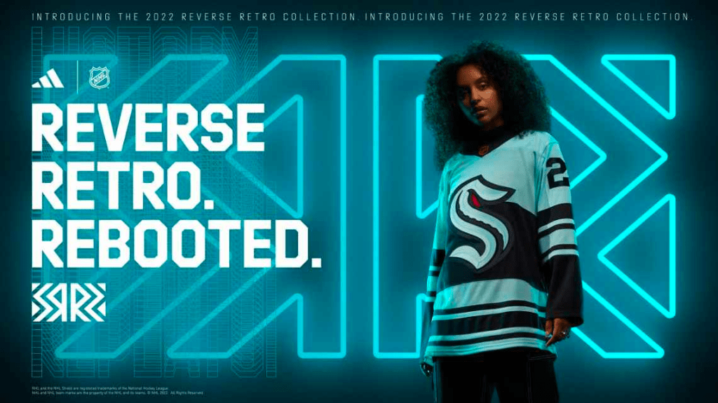
This is only at 32 because they’ve existed for about 37 seconds. They have nothing to look back on and were therefore unable to come up with a historical design. The Seattle Kraken jersey is not the worst of the bunch. Not even CLOSE. But as we have nothing to compare them to, they will sit at the bottom out of pure timing.
These jerseys look good, the Kraken logo is fun (your mascot sucks but that’s not what we’re talking about). Kraken fans, do not take this as an insult. Take this as being gently pushed to the side for a lack of experience while the grown ups fight. For what it’s worth, raw “Do I like these or not?”, I’d put these in the upper half.
31. St. Louis Blues
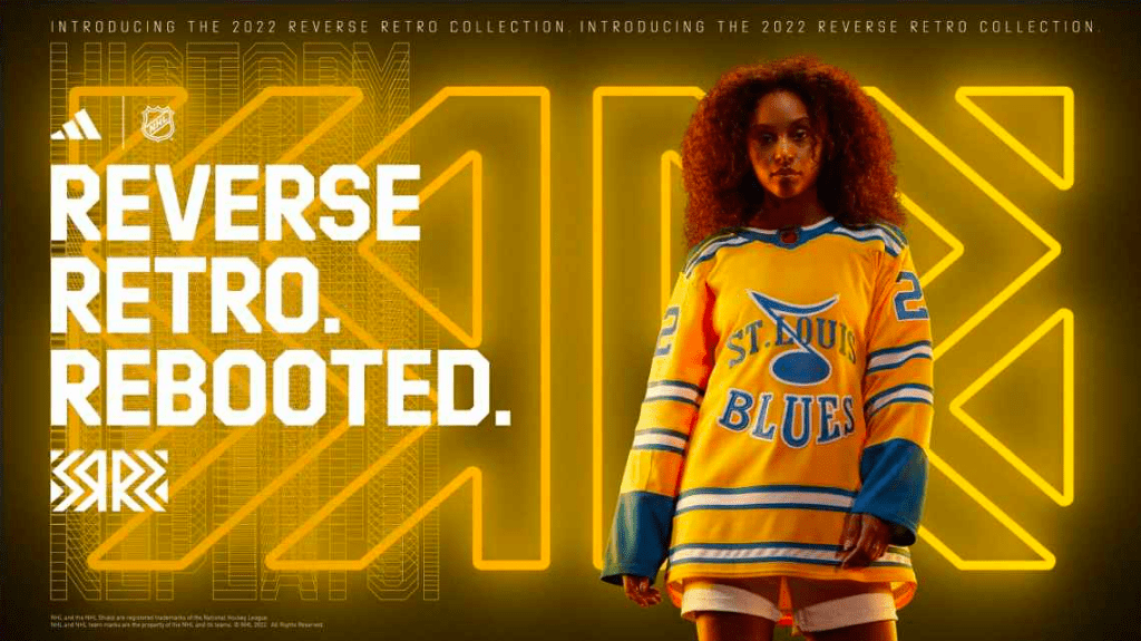
These things just straight up suck. I honestly didn’t want to put these here because some other teams put up just as poor an effort, but yellow (or gold, whatever you wanna call it) jerseys are a TOUGH sell to start with, let alone with that weird font, weird logo placement and outlining some words and not others? Oof.
30. Detroit Red Wings

Zero for two D-Town. You wore practice jerseys last time around. This time around you gave us weird Target-brand Red Wings pyjamas. In the words of Maz, “Somehow Detroit listened to what everyone wanted and still failed.” It’s tough to pull off a two-coloured jersey, tougher when it’s red and black, and the striped knitted sweater look is really difficult, as you’re about to see below.
29. Chicago Blackhawks
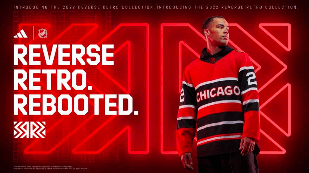
Chicago and Detroit did their homework together, but they changed a few things to make sure the teacher didn’t accuse them of copying. Chicago gets the edge here based solely on the fact that they have a third colour involved in the body of the sweater. Still looks like their grandma knitted it for them. Good to see the Hockey Gods are still punishing this organization for being scumbags.
28. Tampa Bay Lightning
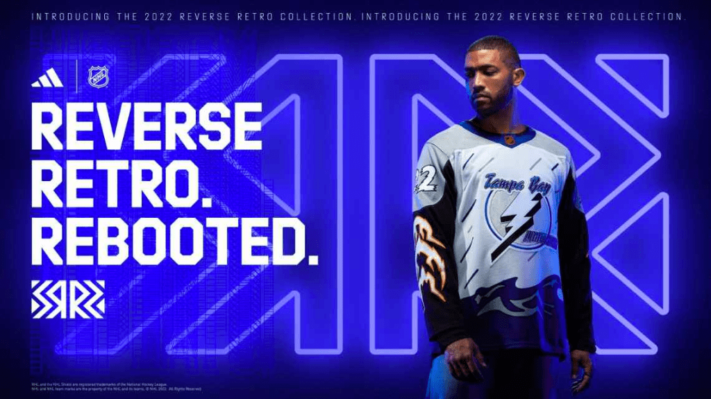
Yikes. Just… straight up yikes. Tampa is not a particularly well-liked franchise around the ol’ Morning Skate water cooler so this is an even easier choice to see at the bottom. This weird, stupid cartoon rain and the waves at the bottom, with the AWFUL, and I reiterate, AWFUL yellow and white lightning bolts on the sleeves. Just horrific, shameful efforts, and I’m glad they suck cause honestly no one really even likes Tampa. The logo is the only redeemable aspect to these things. Brutal.
27. Nashville Predators
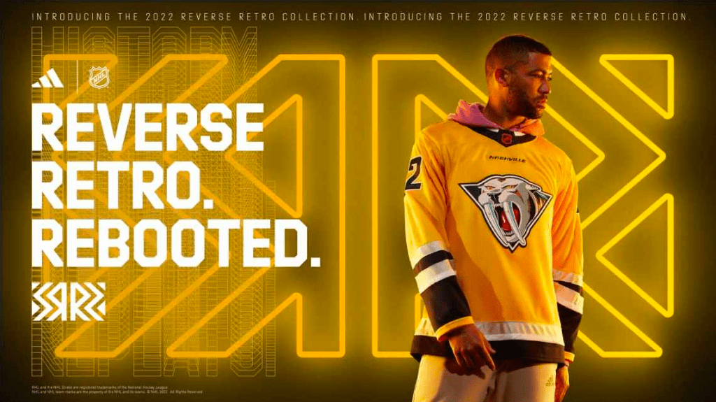
Just the less awful of the yellow jerseys. Smashville has always played with this “Let’s try and pull off French’s Mustard Yellow” for some reason, consistently to no avail. They followed this up by taking their cartooniest of logos and just saying “Whatever, here, lets take everything bad we’ve ever done and get it over with”. Nashville should be writing thank you letters to St. Louis for designing a worse yellow tarp and driving them up the rankings because of it.
26. Edmonton Oilers
Yeah, yeah, of course the Flames writer is going to bury the Oilers jerseys. I get it. Also, shut up, have you seen these things? The Oil Gear logo sucked back then, it still sucks now. Also the orange in your uniforms needs to be the central theme of your uniforms, not navy. The orange home jerseys or third jerseys or whatever they were? Straight gas. These are not. McDavid deserves to look as good as he plays and this is going to add to the long list of reasons he’s leaving at the end of his contract.
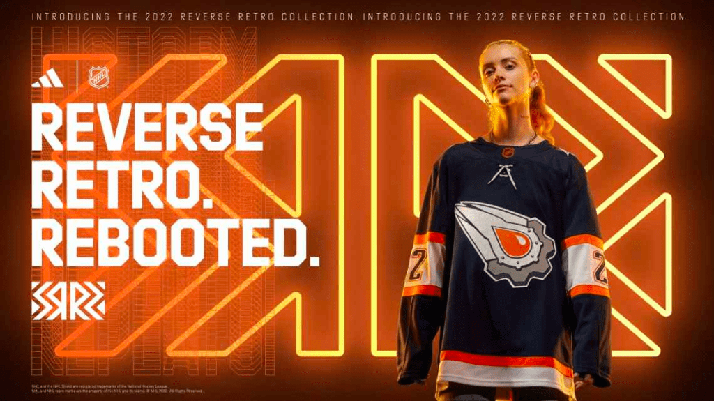
25. Dallas Stars
I genuinely feel bad for putting this one this low, mainly because it had the ingredients for success and just let my precious boy Fink down. Victory Green on a black body, good start. Simple pattern, tasteful. WHERE – and I cannot stress this enough – IS THE MOOTERUS? Dallas deserves it. Hockey deserves it. We all deserve it. Good effort, big miss. Dallas at 25 despite having a chance.
24. Carolina Hurricanes
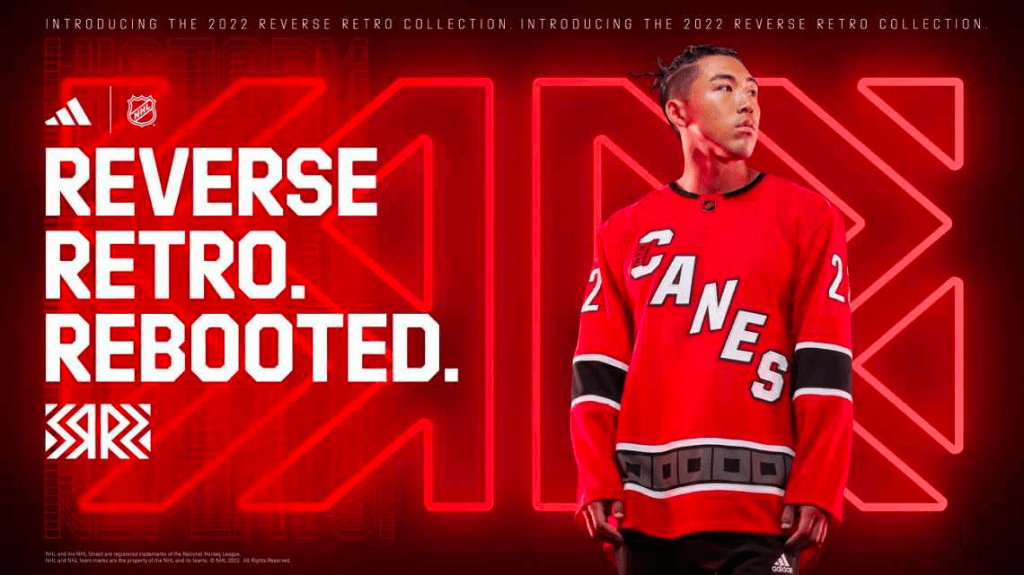
The Canes went hard last time around with their Whalers-inspired greys that they absolutely nailed. This time around they just mailed it in, remixing their road tarps from black to red. Lack of effort = lack of recognition.
23. Philadelphia Flyers

These are practice jerseys. For the same reason Detroit and Ottawa sucked in the first Reverse Retro era, the Flyers suck in this one. It’s the same logo on a white jersey with minimal sleeve colouring. The good news is, early on, the Flyers look like an absolute wagon for now. Enjoy that while it’s going on. I like Philly, but this ain’t it.
22. Vegas Golden Knights
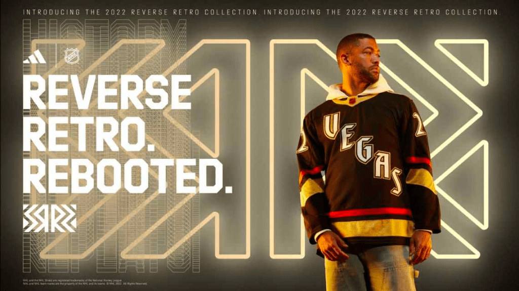
Vegas, like Seattle, hasn’t been around long enough to tug on our nostalgic little heartstrings and make us miss a bygone era of hard-hitting hockey. However they put in a solid little effort in imagining a “classic” version of what their uniforms could have looked like once upon a two-line pass. For the same reason Seattle saw itself at the bottom (basically not even on the list, I still feel bad about it), Vegas sits towards the lower end based solely on it not being a true “retro”. I don’t hate them at all though. (Disco Edit- they also glow in the dark…..cool I guess)
21. Columbus Blue Jackets

These look like mid/late-90’s All-Star jerseys with a Jackets logo on it instead. It’s a weird effort, I want to like them, I’m actively trying to like them, I just simply cannot. I find them uncomfortable and also I hate that Johnny Gaudreau made an active decision to put himself there. Not good.
20. Ottawa Senators

The Top 20 on this list gets way harder than the bottom 12 on this list because more teams did well than did poorly. The bad ones were BAD, the great ones are sensational, but the middle group who did a good job all deserve credit, you just gotta put ’em in order. Ottawa’s jerseys are good. I enjoy the look. I like the old school big numbers and a black body is hard to screw up (sorry, Dallas fans). The sharp, angled red striping isn’t my favourite thing in the world but it doesn’t take away from a good, solid setup. Ottawa kicks off the top 20 with a good, but not a great.
19. San Jose Sharks
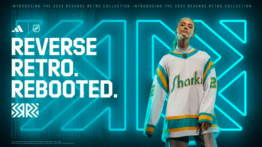
I personally hate these, but that’s a matter of my specific tastes and not how objectively good the design is, and I promised myself I would do this fairly and honestly. The California Golden Seals were awful, so throwing it back to that era is a dicey look. That said, if you wanted a remix of the old school and the new school, you nailed it. New team name, old jersey, classic colours. Well done. Not my favourite by a longshot but it’s a well-delivered concept and I won’t knock quality.
18. New Jersey Devils
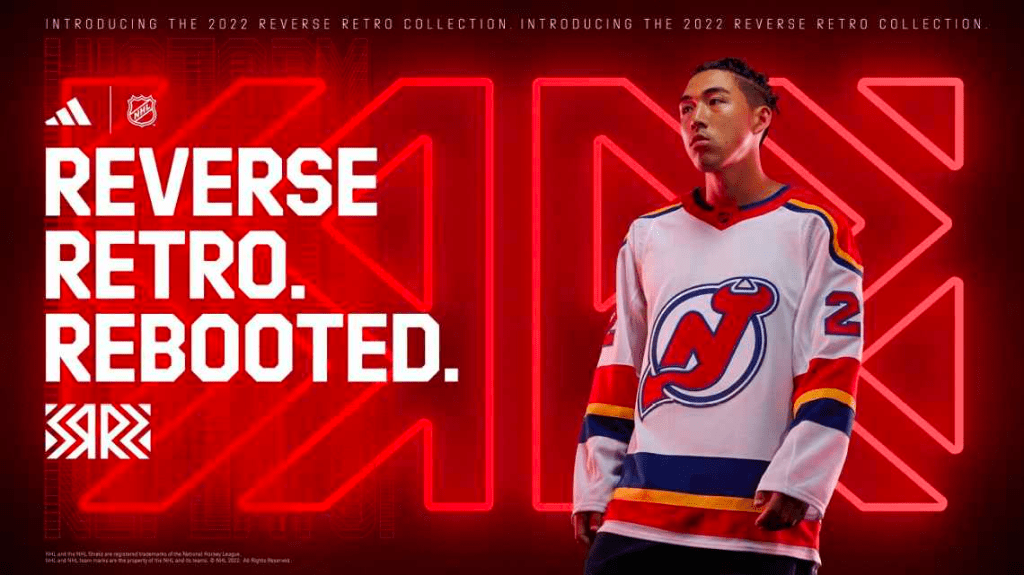
Here we have another example of two teams doing something similar and one team doing a worse job at it. The Colorado Rockies did not go through this campaign underrepresented, but NJ simply didn’t represent them as well as the Avs. That, and the Devils retros last time were the perfect blend of “classic meets modern”, so it’s a tough task to pull it off twice in a row. They absolutely did it, but the Rockies got a better look elsewhere. Again, good, not great.
17. Boston Bruins
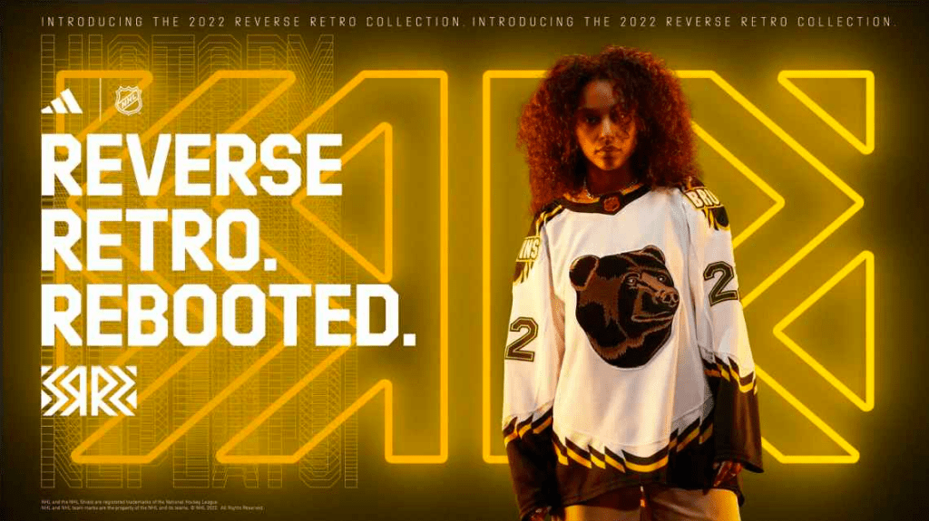
Brownie, I’m sorry. I really am. These are good, the logo is awesome. The jagged stripes and the shoulder patch are cool as hell. I hate it on the white body. That’s it. The white jersey kills this for me. In every single circumstance, a team’s dark jersey is better than its lights. This is no exception. The top group here are all packed pretty tightly in so I gotta find anything I can to separate them. Please forgive me, Brownie, but as far as “the white is worse than the dark would have been” goes, these are the biggest dip in the standings based on it.
16. Calgary Flames

This annoyed me because I had SUCH high hopes. Everything about this is awesome minus the pedestal thing. I know it’s classic, and the whole idea was to bring old and new together, but the pedestal wasn’t good then, so putting the modern logo with the white on gold against a black version of the jersey is underwhelming. The Flames colour scheme goes so hard and the logo is so good that the jersey is an overall win but the pedestal thing is not my favourite and I’m bummed they didn’t pull it off like they could have.
15. New York Rangers
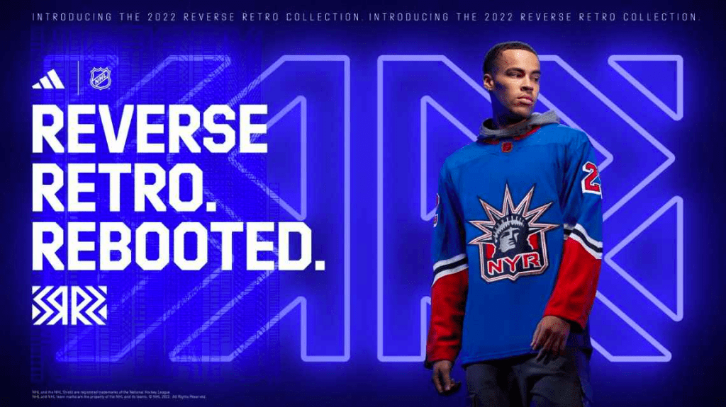
These are awesome, but the move from navy to royal (which I get was the whole point) feels weird. I think if we were mixing concepts I’d have rather seen the modern jersey design on the navy colour scheme with Lady Liberty on the shoulders, but this still feels like an overall good go at it. The tough thing about being a historic franchise with very little movement in jersey design is that it handcuffs you with regards to options. 10/10 would still absolutely rock this though.
14. Buffalo Sabres
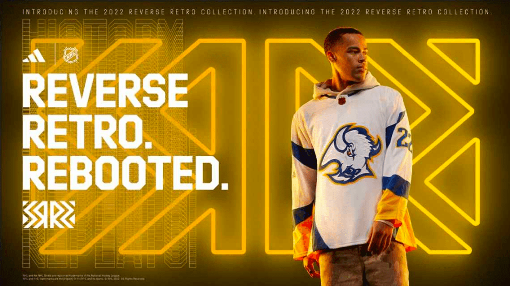
I love this logo, I assumed it would be amazing with the blue and gold colour scheme. Turns out it’s better on the red and chrome, but honestly, I still like these a heck of a lot. As with the Boston jerseys though, they’re white, and it takes away from rebirthing classic colour schemes and it’s just less visually flashy. Success from the Sabres. Something we do not hear often.
13. Vancouver Canucks
Simple, classic, effective, well-delivered. Blue and green is tough to pull off. They did it anyways. Classic logo is nice, jersey design is good. No complaints. Nothing absolutely amazing about them, but nothing wrong at all. Toeing the line between good and great.
12. Pittsburgh Penguins
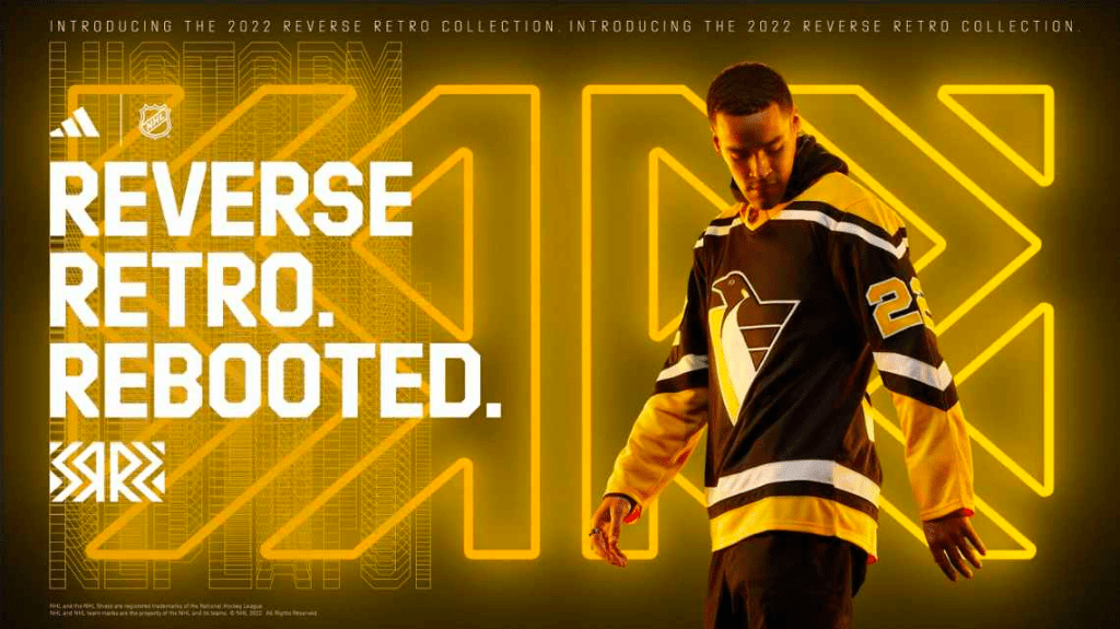
Iconic logo from the best Penguins era. Black jersey with the classic, timeless Pittsburgh-staple black and gold. Phenomenal work, seen only outside the Top 10 because more than ten other teams did a better job but I have not one goddamn negative thing to say about these, and that’s saying a lot since I absolutely despise every single sports team out of the city of Pittsburgh, Pennsylvania.
11. Minnesota Wild
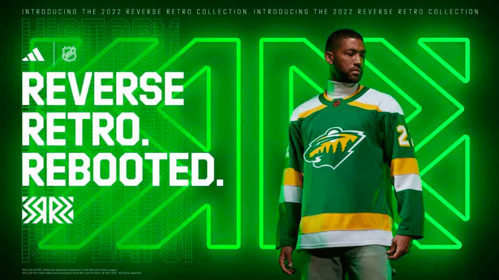
…and this year’s Gold Medallist for “If it ain’t broke, don’t fix it”, The Minnesota Wild. They had a good concept with their North Stars scheme on the modern logo, they put it on a white jersey, which can then only be improved by doing the exact same thing on a home dark. Exceptional work by the Wild marketing team, understanding that good things need not be fucked with.
10. New York Islanders
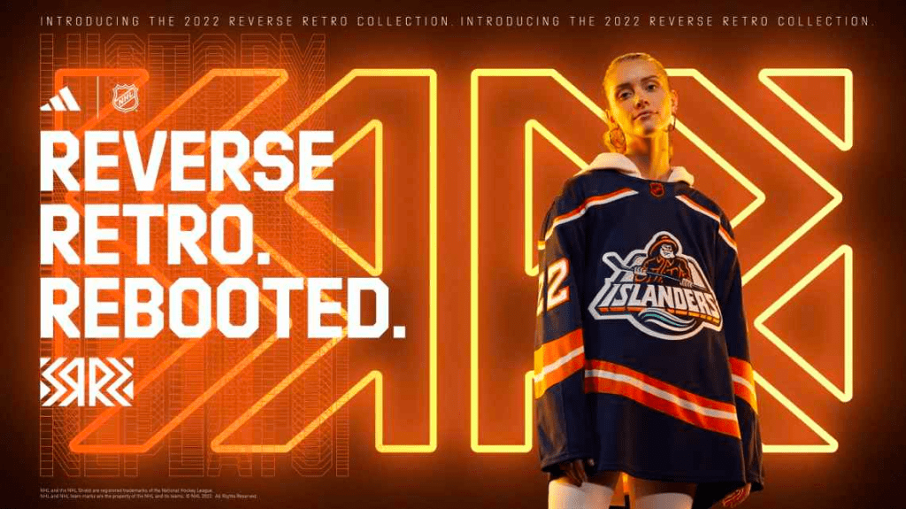
You took a classic and you made it better. I honestly don’t have a clue why this logo isn’t the full-time logo but who the hell am I to make demands of a team I don’t think I’ve ever watched play hockey. Amazing all-around. Edmonton could have taken a lot of notes on how to effectively use navy and orange but instead they did what Edmonton does and take a good thing, and WASTE IT. Amazing work, and thank goodness, because as Brownie mentioned on this week’s pod “Gotta pay for that new arena”.
9. Washington Capitals
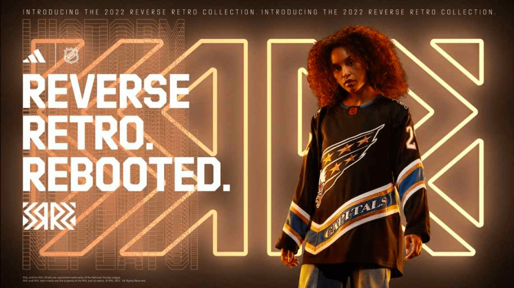
So sick. The Screamin’ Eagle is a nasty logo, always has been. The blue, black and bronze scheme is also super unique and I’m a fan. That, and the fact that we got a sneak peak at the tender’s bronze and blue pads, the look is going to be mucho tasteful. Bravo D.C. The Ovi Chases Wayne Tour is officially riding in style.
8. Winnipeg Jets

It’s a white jersey again, and the Jets first attack at the Reverse Retros was a special event. These are still filthy. The old school logo is way better than the one they have now, and combining the current colour scheme with the old logo, chefs kiss. Too bad Winnipeg might be the worst city on the planet.
7. Toronto Maple Leafs
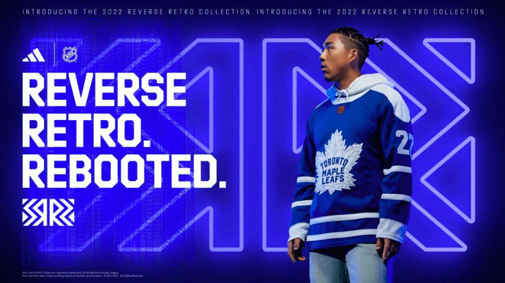
I’m happy for Leafs fans, and I never say that. Ever. But they have nothing to ever TRULY be happy about, and the last time we did this Reverse Retro thing, they absolutely blew it. They were ASS. This time around the Buds simplified everything. A classic logo on a home dark, with a simple stripe pattern and voila, we have a masterpiece that we can see them rock for 6-7 postseason games before Matthews gets one season closer to moving home.
6. Colorado Avalanche

Love these. That, and New Jersey set the bar relatively high, Colorado just simply did a better job. It’s that simple. Colorado is now a resounding 2 for 2 on successfully navigating the Reverse Retro delivery, and the defending Champs are gonna look even more cool for another handful of games this season while they chase the repeat.
5. Anaheim Ducks
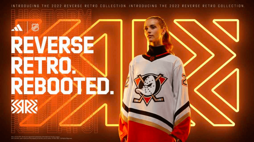
Crisp. Clean. Logo that brings back my childhood. Mix that with the current colour scheme. Put in the oven for 20 minutes at 300 degrees. Out pops exactly what we are looking for. For me, the Ducks had one of two options, take the jade and eggplant and toss it on the webbed D logo, or do exactly this. They chose correctly. Truly phenomenal work, crossing nostalgia with simplicity and hitting the nail on the goddamn head. Charlie Conway salutes you. Quack quack.
4. Los Angeles Kings
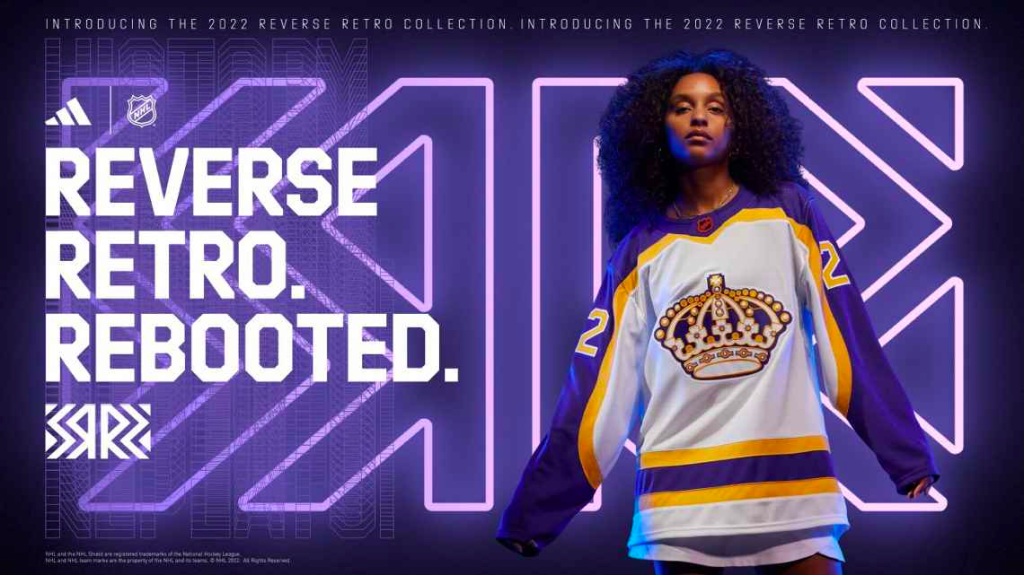
Given that they were the absolute runaway champs when judging the first set of Reverse Retros, expectations surrounding the Kings could not have been higher in the sequel. They absolutely did not disappoint. Sadly they didn’t bring the best of the bunch twice in a row but it is IMPOSSIBLE to miss with a well-executed purple and gold scheme (See: Minnesota Vikings, Los Angeles Lakers). But why, oh why, do we have to use white jerseys. I know I’m a hater, and I accept that and acknowledge it, but last years purple jersey was better than this, primarily because it was dark. This logo is absolutely gnarly, and apparently the jewels on the crown are raised and somewhat 3D which is disgustingly cool. No one should ever expect the Kings to put out a bad classic jersey provided they are using the old colour scheme, because it’s outrageously good.
3. Florida Panthers
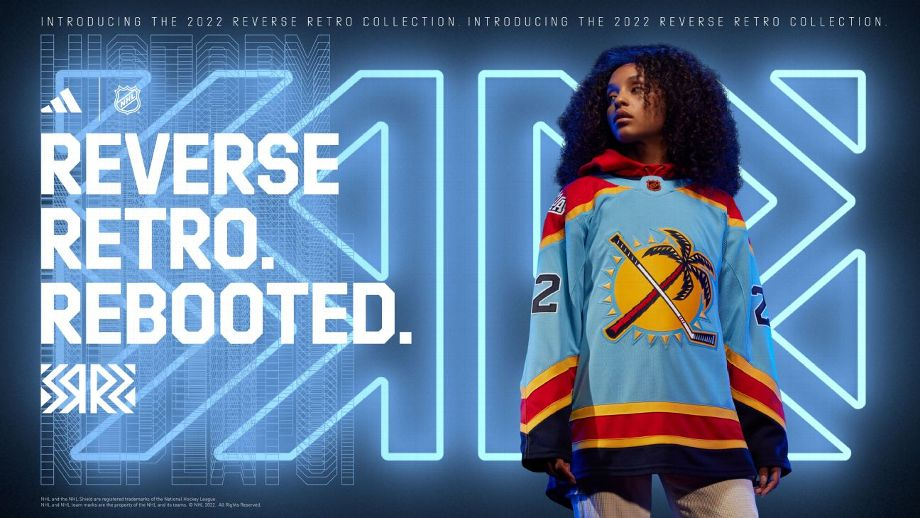
Gas. Straight gas. I honestly struggled leaving them this low. They’re SO GOOD. A jersey that says “We play hockey in South Florida, and it’s awesome”. The colour scheme is sensational, the logo is goofy and fun, which hockey absolutely needs to continue leaning on. Hockey is super fucking fun, and Florida is absolutely hellbent on letting the world know that doing fun shit with good weather is even better. Thank you Florida for Huberdeau, Weegar, and these absolutely fantastic tarps.
2. Arizona Coyotes
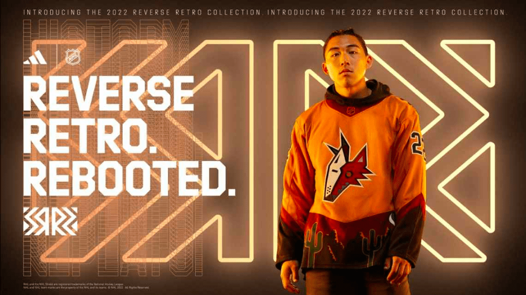
Listen, Arizona hockey fans have criminally few things to be excited about, so I will not apologize for giving this uniform the credit it is due. The Kachina was an All-Time uniform. They went hard in the paint last time with the bright purple, crescent moon outfit. This time we took a jersey that absolutely worked out originally, made it more subtle, kept what was working, and moved even truer to the roots of the (current) home of the franchise. They’re sick, and they’re super unique, and I think the Coyotes as an organization don’t even deserve to exist but I’d rock the shit out of this anyways. Austin Matthews is going to look like a goddamn STUD in this thing.
1.. Montreal Canadiens
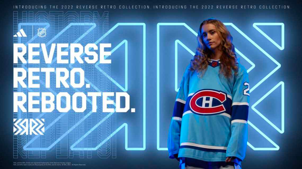
They’re flawless. The Habs have only had one logo for approximately 863 years, so you know what you’re gonna get with them. However the baby blue, paying their respects to the (RIP) Expos, especially since your current mascot defaulted to you from the baseball days, is a perfect choice. That, and Carolina Blue is one of the absolute best sports colours if you pull it off, which in this case Montreal absolutely does. Because the Montreal uniform history is so simple, and one might even say boring, any change with them seems drastic. Maybe that influences why I love these so much. Maybe it’s my childhood memories of Expos baseball on TV. Maybe it’s just that they’re fuckin’ sick. It’s that one. They’re absolutely sick and I’m not sorry. This is the right answer, as are the 31 before this.
If you got this far, I want you to know that you’re a winner, and the world needs more of you. That, and I want you to sound off at @jenkinsa81 on Twitter because I know every single one of you disagrees with me. Let’s hear it.

Terrible list. Montreal homers….enjoy bottom of the league for another year
LikeLike